Simplified Patient Experience
Modernize Datacubed Health's mobile user experience to efficiently display actionable tasks and boost clinical study's compliance rate.


Why the Need for a Simplified Patient Experience?
The Datacubed mobile app version 1 improved patient engagement in clinical trials by using gamification, making participation less intimidating. However, its "childish" design received criticism from potential clients, deterring them from collaborating with Datacubed and leading to missed business opportunities. From this we learned that an overly gamified platform may give the impression that the patient's illness is not taken seriously.
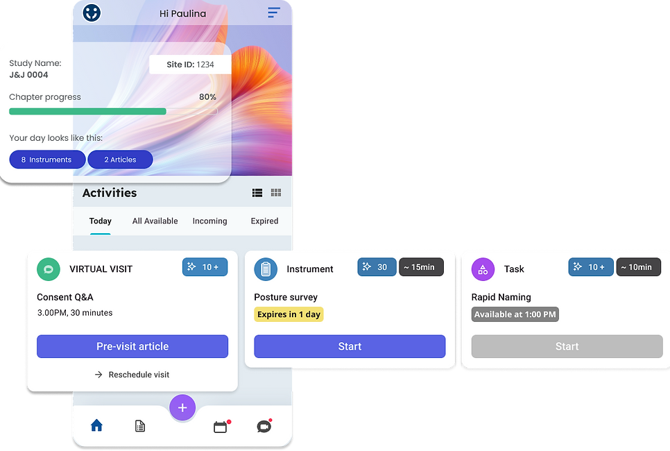
As a result, we plan to offer clients an alternative mobile experience for their studies: a Simplified Patient Experience. This modernization focuses on creating clear visual hierarchy of actionable tasks and reimagining gamification elements on the mobile home screen.
Role
Lead Designer
Tools used

Figma

Atlassian Suite

Zeplin
Timeline
November 23' - March 24'
Problems to Tackle:
1. How may we offer a home screen experience that optimizes navigation for better patient engagement?
2. How may we empathize with our users by adjusting the "tone" of UI?
Mobile App Version 1
...and its limitations


Home screen
Activities to complete
Progress review

The Datacubed Health mobile app's version 1 home screen featured interactive maps that tracked progress based on task completion. However, potential clients found the highly animated graphics off-putting, considering them too whimsical for the serious nature of their patients' conditions.
Additionally, issues included:
-
Patients had difficulty finding the icon to access actionable tasks, affecting study compliance rates.
-
Technical complexities in the home screen's map progression led to numerous bug reports, diverting resources from more significant feature enhancements.


Heuristic evaluation of feature inventory and card-sorting workshops.
Design Principals to Refine MVPs
After conducting comprehensive research, we pinpointed enhancing the navigation of the mobile app as the central focus of this project. Subsequently, we refined the project's scope to prioritize Minimum Viable Products (MVPs) that align with our objectives and allocated resources. Identified MVPs are as follows:
Transparency
Scalable dashboard that handles various task deployment scenarios
Centralized Information
Centralized and consolidated calendar
Clear and Simple
Clear sense of hierarchy and highlight actionable tasks
Design Principal
MVP
Initial Iterations


Option 1.
Maintain the visual concept of "progression" through the study. Replace the map UI with a cleaner and more modern UI that highlights daily tasks to be completed.
This approach still proposed some challenges in scalability to support niche use cases.
Option 2.
Completely redesign the home screen experience by creating a dashboard that eliminates any guesswork for the patient. This UI should display all tasks clearly, without requiring the patient to click into anything.
This approach was a larger up-front effort for the engineers. But once implemented, it was the more flexible solution that supports wider use cases.
Final Product
After conducting A/B testing with proxy users, we chose option 2. It was received positively for its ease of use and clear information delivery, improvements over the original map home screen.
We further refined the information hierarchy, collaborated with project managers to test the new dashboard's scalability, and worked with engineers to ensure the designs integrate smoothly with the existing technical framework.
Since existing clients and clinical studies will not utilize the new home screen, our strategy involves onboarding any new clients with this dashboard instead of the original home screen. Following this transition, we intend to gather additional data on the usage of the new dashboard to assess its effectiveness. Specifically, we aim to evaluate the impact of presenting all tasks on both the home screen and the centralized calendar to optimize user experience and study compliance rates.
Learnings and Next Steps
Before

After

Clear Call-to-Action
We streamlined the navigation process, eliminating unnecessary steps for users to access study-related tasks. The simplified home screen now presents tasks requiring immediate attention upon user login, categorized based on their scheduled expiration dates. This pre-filtered view enables users to promptly prioritize tasks, enhancing study compliance rates and overall user experience.



Before
After
Centralized Calendar
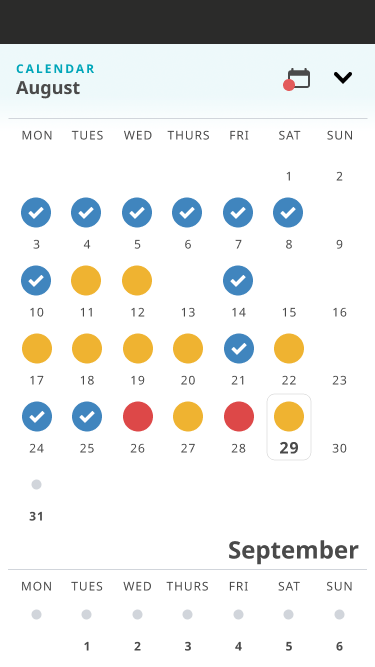
User feedback highlighted confusion over the calendar's exclusive display of Diary tasks, neglecting other study-related tasks or scheduled appointments.
In response, we changed the calendar to allow users to access tasks through both the new dashboard and a centralized calendar. This improved view not only displays activities to complete but also visually tracks completion history by user, enhancing usability and providing a sense of accountability through clear insights.

Scalable Solution
The original home screen frequently encountered technical issues stemming from its engineering. This constraint resulted in a restriction on the number of tasks that could be assigned to users simultaneously. The revamped dashboard eliminates the need for complex development logic, enabling a more adaptable and scalable framework to support clinical trials effectively.
Research
Competitive & Comparative Analysis
Done on competitor clinical trial mobile apps and similar social platforms use gamification as user retention strategy.
- Medable. Direct competitor that supports mobile app. Engages users through effective notification strategies.
- Duolingo. EdTech mobile app that incorporated key gamification elements, such as points, streaks, and rewards, to make the learning process fun and addictive.
- Noom: Weight management service that uses the latest in proven behavioral science to help users create healthier lifestyle.
- Albert: FinTech mobile app that analyzes users' spending habits to suggest relevant tips on building wealth.
User Interviews
I collaborated with our internal behavioral science team to conduct an in-depth analysis of user pain points. We surveyed proxy users about their past experiences with the Datacubed mobile app and conducted a brief usability test focusing on the current home screen.
Workshops with Internal Teams
I facilitated workshops with Datacube's Project Management teams, who regularly engage with clients. These sessions gathered feature inventory evaluations of the current mobile experience and elicited feedback from team members on enhancing the home screen experience.


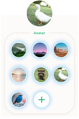

Avatar customization with images instead of characters.
Home screen background personalization.
Modernized Gamification and Personalization
Our research indicated minimal interest in the avatar customization feature within the current mobile experience. Additionally, client feedback frequently cited concerns regarding overly animated avatars, prompting requests for custom coding to remove this feature entirely. In alignment with our commitment to enhancing user engagement through behavioral science, we developed alternative methods for users to establish their identity within the mobile app.
Thanks for scrolling through!


Investment Made Easy
Intuitive dashboard of patient engagement and compliance metrics that shares AI generated insights with clinical trial staff.
A seamless workflow for physicians to create, deploy, and monitor consent statuses of clinical study patients.
Transparent investing experience for novices through personalized learning content and elevated discovery flow.
(Coming Soon)